

Ever seen a website without a single image? Probably not. They’re everywhere on the internet, right?
But images aren’t just pretty pictures for blog posts, either. We’re talking about everything from layouts and design elements to logos and profile pics.
Now, you simply can’t build a website without using them. But, as any website owner or front-end developer knows, images aren’t always easy to deal with.
BlueCorona found that 39% of people stop engaging with a site when images take too long to load. Google considers site speed when ranking results, where image optimization plays a huge role — read our new article to learn more: How to Optimize Core Web Vitals in 2024.
Besides choosing the right images and figuring out where to put them, there are technical challenges too:
- How do you make images look good on phones, tablets, and desktops?
- How do you keep them sharp and clear on all devices?
- Most importantly, how do you ensure they load quickly, so visitors stay energized and on the page?
These are questions we are considering today. Let’s dive into the guide on optimizing images for the web and making them look amazing on any device. Your website’s speed and user experience depend on it.
Why does image optimization matter?
Images make websites beautiful and engaging. But here’s the thing: those lovely images come with a cost. They can take up a huge amount of space and bandwidth on your site.
Check this out: images are 51% the size of a typical web page. That’s massive. And it’s not like we can just remove images altogether.
So, what can we do instead? Optimize them, of course!
The benefits are huge:
- Your pages will load faster, even on mobile devices with unstable connections. This means visitors will be happier, stay on the site longer, and explore more of your content.
- Search engines love fast websites. By optimizing images for the web, you improve your SEO and increase your chances of ranking higher in search results.
- Image optimization tools help ensure your images look sharp and load quickly on all smartphones and tablets.
- No one likes waiting for pics to load. By optimizing them, you’re creating a smoother, more enjoyable user experience.
But wait, there’s more! Image optimization can also save bandwidth and storage costs. In addition, the speed of loading images on the site directly affects the Largest Contentful Paint (LCP) indicator.
Read more about the benefits of database optimization for the business in our latest article.
The 5 key steps to properly optimize images for a website
The goal of image optimization is to walk that fine line between having visually stunning images and lightning-fast loading times. You want your images to look their best without bogging down your website.
How do we achieve this balance?
You don’t need to be a tech whiz to start. There are many image optimization tools and plugins to help you improve your pictures with ease. We’ll delve into these in more detail later.
Choosing the appropriate image file format
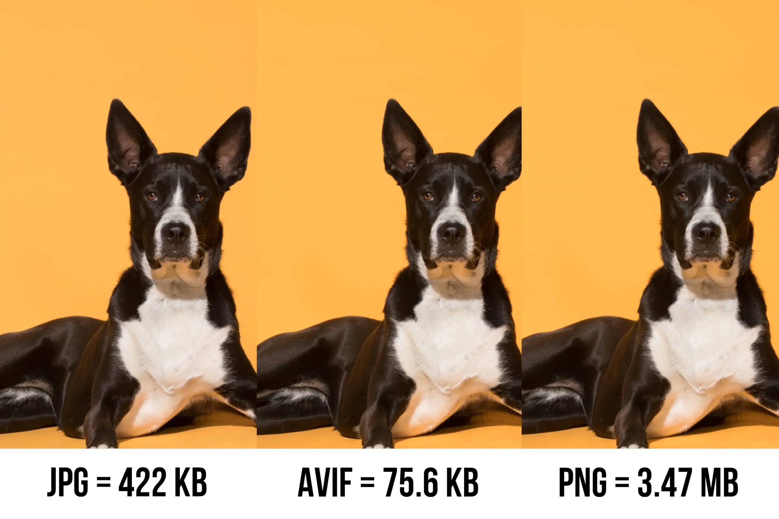
There are three main options: JPEG, PNG, and GIF. Each one has its own strengths and best use cases, so choosing the appropriate format is crucial for optimizing your images for the web.
If you’re looking to take your image optimization to the next level, check out these formats:
- WebP — developed by Google, WebP offers both lossy and lossless compression and can significantly reduce image file sizes compared to JPEGs and PNGs.
- AVIF — this format boasts even better compression than WebP while maintaining excellent image quality. However, it’s not yet universally supported by all browsers.
The key thing to remember is that each of these formats excels at different things. Photos = JPEG, graphics/transparency = PNG, animations = GIF (or video), with WebP and AVIF being solid modern alternatives.
Not sure which format is best for a particular image? Google’s PageSpeed Insights tool can analyze your images and suggest optimizations, including the ideal format. You can even download the optimized versions directly from the service.
Image compression techniques
After you’ve got your images in the right file format and properly sized, it’s time to compress them for maximum website optimization. There are two main types of compression: lossy and lossless.
Lossy compression gets rid of some image data to make the file smaller, while lossless compression reorganizes the existing data into a more compact package.
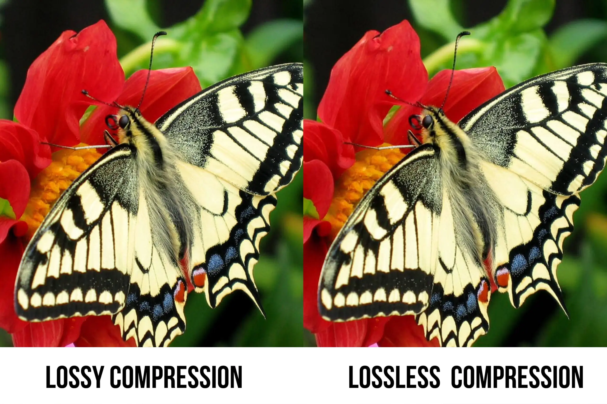
For photographs and images with lots of colours/details, lossy compression is usually the way to go. It’ll shrink the file, and you likely won’t even notice the slight quality loss. But for graphics, icons, and images with fewer colours, stick to lossless so you don’t lose any important details.
Many tools are available to streamline the image compression process, here are some of the most popular.
TinyPNG
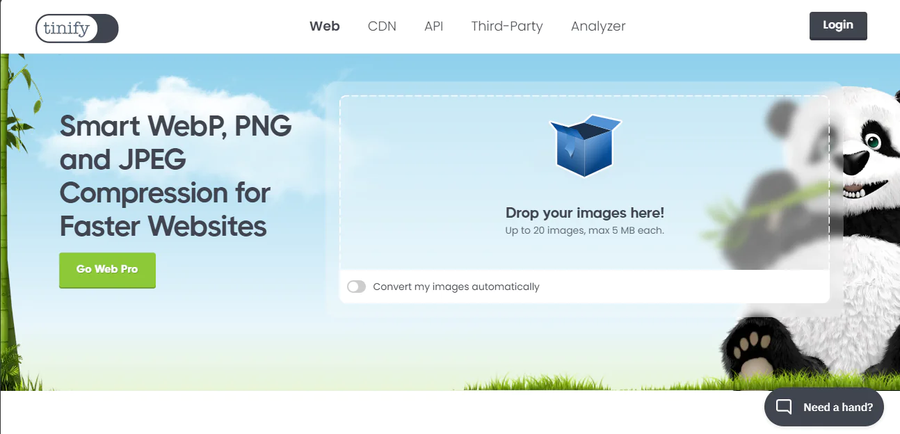
Leveraging intelligent lossy compression, TinyPNG efficiently reduces PNG and JPEG file sizes without compromising visual quality.
Optimizilla
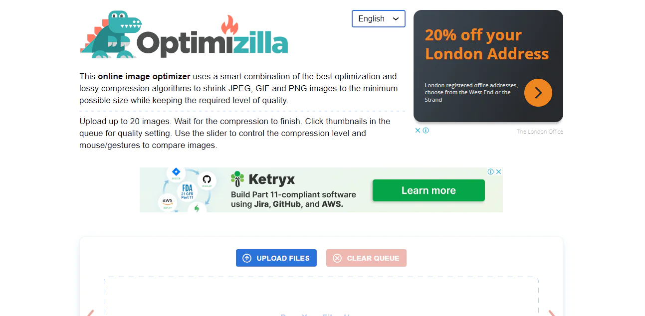
This versatile online tool provides customizable compression levels, allowing users to fine-tune the balance between file size and image quality.
ImageOptim (Mac)
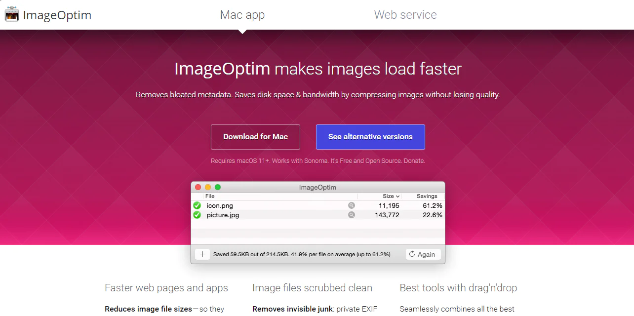
Combining various lossless compression techniques, ImageOptim effectively optimizes images without sacrificing quality.
FileOptimizer (Windows)
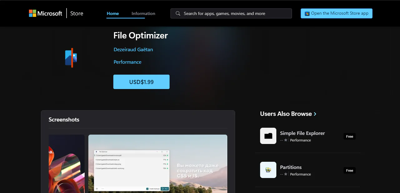
A versatile free tool capable of compressing various file types, including images, with both lossy and lossless options.
Resizing and cropping images
One of the easiest ways to optimize images is by resizing or cropping them before you upload them to your website. This is particularly important for large, high-resolution images from digital cameras, which often have dimensions far exceeding what’s necessary for web display.
For example, imagine your website displays blog images at 500 pixels by 500 pixels. Uploading a 1024-pixel by 1024-pixel image means all those extra pixels are adding unnecessary weight to the file, slowing down your site without any visual benefit.
You can easily resize or crop them using various editing tools, both online and offline. Popular options include GIMP or even simpler tools like Preview (Mac) or Paint (Windows).
However, when choosing the right image size, there’s more to consider than just the dimensions of the container where the image will be displayed.
DPR (device pixel ratio) refers to the ratio between the physical pixels on a device’s screen and the logical pixels used by the operating system. For example, a device with a DPR of 2 means that each logical pixel is represented by 2 physical pixels.
Therefore, if an image is displayed in a 500-pixel by 500-pixel container on a device with a DPR of 2, the optimal image size would be 1000 pixels by 1000 pixels.
There are a lot of nuances, so another option is to entrust website optimization to an experienced web development company.
Using lazy loading
Picture this: you land on a webpage, and instead of waiting for all the images to load at once, only the ones you see immediately pop up. As you scroll down, more images magically appear, just in time for you to view them. That’s lazy loading in action.
This technique delays image loading until they’re actually needed. When a visitor first arrives on your page, only the images above the fold (the visible part of the page) are loaded. As they scroll down, the rest of the images are fetched and displayed on the fly.
Modern browsers support lazy loading through the loading=”lazy” attribute within image tags. This simplifies implementation, requiring no additional JavaScript libraries or plugins.
However, for older browsers or more complex scenarios, JavaScript libraries like LazyLoad or yall.js offer enhanced functionality and customization options.
Responsive images
Let’s be real, your website visitors aren’t all sitting at their desks staring at huge monitors. They’re checking out your site on their phones, tablets, and maybe even their smartwatches.
The idea behind responsive images is simple. Instead of loading a single, massive image file on all devices, you provide multiple versions of each image at different sizes. Then, the browser can intelligently choose and download the perfectly sized image for that particular screen and resolution.
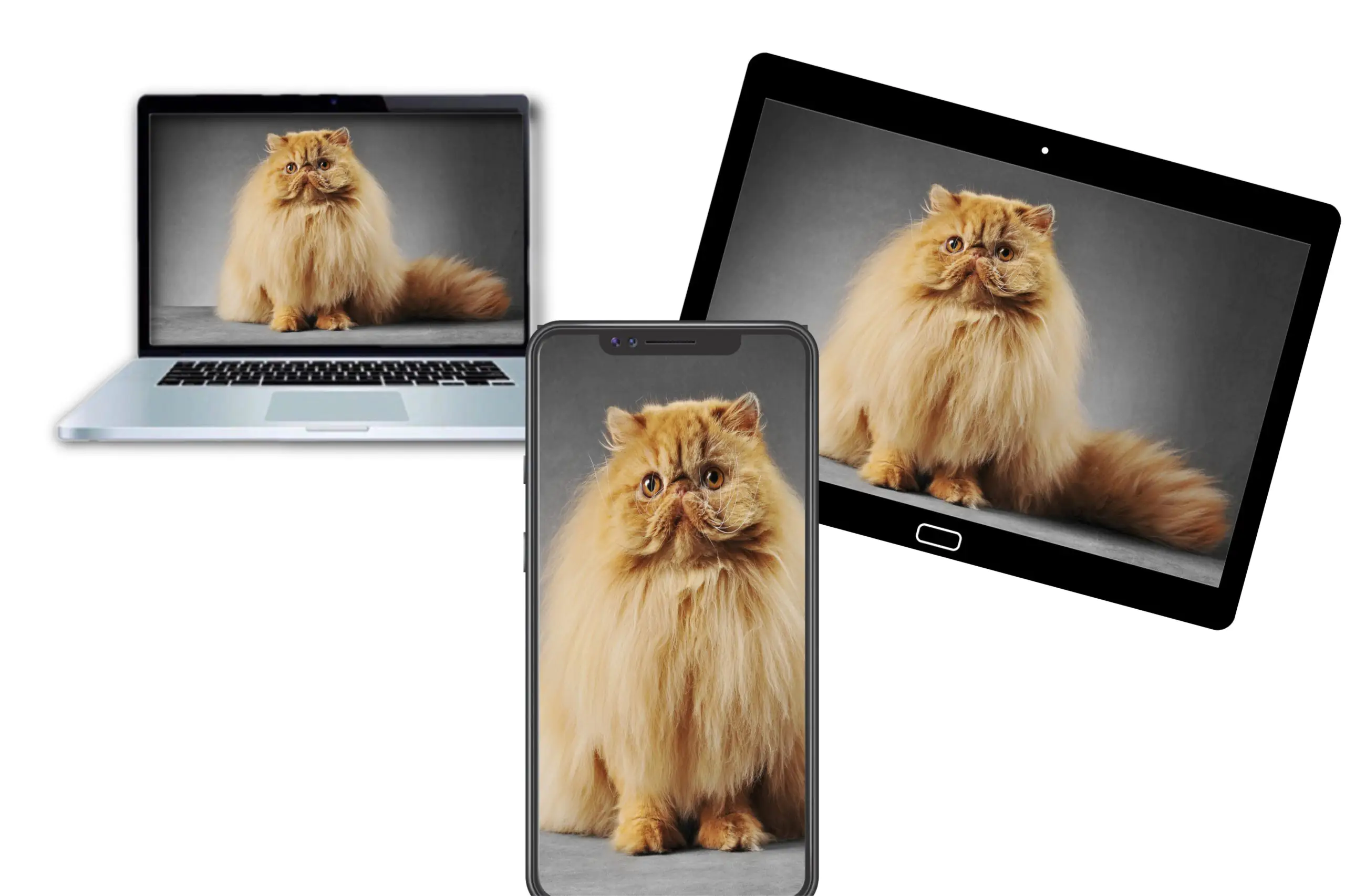
For example, you might have a large 2000px version for desktop displays, a 1000px one for tablets, and a 500px image for mobile phones. By serving the right-sized asset, you avoid wasting bandwidth on downloading unnecessary pixels while still delivering a crisp experience.
Responsive images work using the srcset and sizes attributes in your <img> tags:
<img srcset=”image-500.jpg 500w, image-1000.jpg 1000w, image-2000.jpg 2000w” sizes=”(max-width: 600px) 500px, (max-width: 1200px) 1000px, 2000px” src=”image-2000.jpg” alt=”Responsive image”>
The srcset lists the different image files and their widths. The sizes attribute describes the layout size at different viewport widths. The browser combines this info to choose the best image source for that screen size and device pixel ratio.
The importance of descriptive Alt text
Okay, here’s the thing: search engines aren’t mind readers. They can’t actually “see” your images, so they rely on alt aka alternative text — that little description you add to your image code — to figure out what’s going on.
Why does this matter?
Well, for starters, it helps visually impaired folks who use screen readers understand your images. But it also helps search engines index your images and figure out if they’re relevant to someone’s search query.
Here are a few tips on how to write good alt text:
- Don’t just say “image” or “photo”. Explain what’s happening in the image and why it’s important.
- Search engines are smart enough to understand context. Just write a natural description.
- If you’re trying to rank for a particular term, include it in your alt text (but don’t overdo it).
- Consider how the image relates to the surrounding content and write your alt text accordingly.
Now, you might be wondering,
Do I really need to know HTML to add alt text?
Don’t worry, most website builders and content management systems have built-in tools that let you add alt text easily. Just look for the “alt text” field when you upload or insert an image.
If you’re coding your site from scratch without a visual editor, you’ll need to use HTML’s alt attribute within the image tag:
<img src=”hiking-boots.jpg” alt=”summer hiking boots – brown leather boots on a rocky trail”>
Adding alt text is a simple way to make your site more accessible and optimize images for websites for better SEO.
Wrapping up
By now, you understand just how crucial image optimization is for delivering a fast, enjoyable website experience. The benefits are numerous, from speeding up load times to boosting SEO and saving bandwidth.
The good news? Getting started is easier than you might think.
By choosing the right file formats, compressing images, resizing them appropriately, and implementing lazy loading, you can significantly reduce loading times and create a smoother browsing experience for your visitors.
Still, feeling a little lost on where to begin? No problem! The Alva experts are here to help.
Reach out for a comprehensive SEO audit, and we’ll analyze your site’s images (along with other key factors) to identify optimization opportunities.
A faster, more engaging website is within reach. All it takes is prioritizing visual optimization as part of your e-commerce strategy.
What are you waiting for? Request your free audit today, and let’s get to work.