With each year, thriving in the digital world takes more refined techniques. That’s why having only a good product in 2024 is not enough; it requires an excellent user experience (UX).
In today’s rapidly evolving landscape, you need to ensure your customers’ journey through your website is seamless, engaging, and tailored to their specific needs. How? To learn more, keep reading.
In this article, we’ll unravel the secrets of the e-commerce UX best practices that will keep your customers engaged, satisfied, and coming back for more. Get ready to transform your website into a conversion powerhouse!
What is UX in E-commerce?
User experience for e-commerce is the art and science of crafting intuitive, efficient, and engaging digital experiences. The main goal of e-commerce UX is to turn a visit into a sale. This involves employing user-centered design principles to optimize the usability, accessibility, and overall satisfaction of users interacting with your platform.
Think of it as personalization through engaging feature-rich UI design that makes users feel heard and seen while effortlessly using interface cues. By following the best practices revealed below, you’ll create a digital shopping experience that customers won’t be able to resist.
4 keys to building an e-commerce website customers will love
A website is a place where a random person can become your client and even a brand advocate. Do you dream of having a conversion rate of an incredible 70-80%?
It’s possible if you keep this in mind when creating or improving your website:
The most important thing is customer experience and website visitors’ satisfaction!
How to ensure this in practice? Follow the four principles described below.
By the way, are you planning to create a website for your store from scratch? Wondering how much it will cost?
We have an article with a detailed breakdown of prices depending on the type of website. You will know exactly what it costs and will be able to choose the best option for yourself.
Intuitive Navigation: Finding the Treasure Map
Imagine entering a sprawling mall without signs or directions. A bit frustrating, isn’t it? The same goes for your e-commerce website. 67% of mobile users simply leave a website if they get frustrated with its navigation.
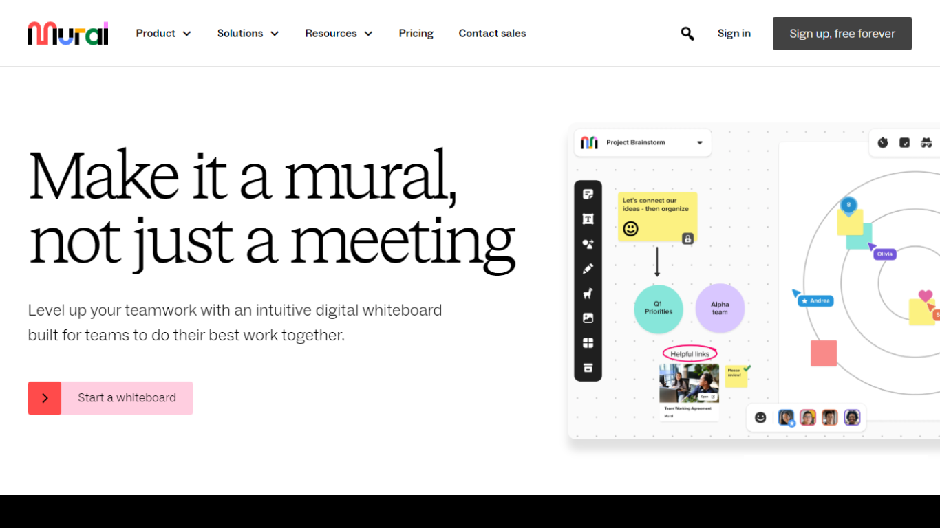
On the contrary, going for intuitive navigation provides clear signposts, making it a breeze for customers to find what they’re looking for. You might want to implement a user-friendly menu, convenient search functionality, and easy access to the shopping cart. Moreover, breadcrumbs and quick links will make your customer’s journey smoother than ever.

Source: Mural
Mobile-Friendly Design: Embrace the Mobile Revolution
Do you ever catch yourself shopping on Amazon in bed when you can’t fall asleep? The chances are, you’re among those countless millions of mobile shoppers. In fact, Statista claims that 63% of all online orders in 2022 came from mobile users. So, optimizing your website for the phone is a must, not an option.
One of the best practices for e-commerce user experience is to embrace responsive design, which ensures your site looks just as good on screens of all sizes. Also, implementing touch-friendly interfaces and mobile-optimized product images and descriptions is essential for catering to your mobile shopping audience.

Source: Airbnb
Streamlined Checkout Process: Smooth Sailing to the Finish Line
Remember that moment when you’re about to buy something only to be faced with a long and complicated checkout process? It’s a surefire way to chase customers away. So what should you do instead?
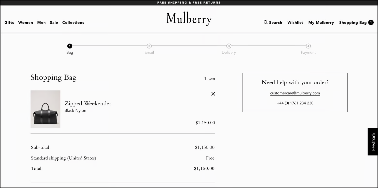
Following UX best practices for e-commerce, simplify the checkout flow by minimizing the number of steps and form fields required. Offer guest checkout options to eliminate the need to create an account.
Also, provides the option for users to save their details for future purchases. Enhance the overall checkout experience by incorporating progress indicators, clear error messages, and multiple payment options.

Source: Mulberry
Fast Loading: Need for Speed
In a world where every second counts, slow loading speeds are the ultimate buzzkill. This leads to frustration and causes users to abandon their shopping journey. For business owners, one extra second in page load costs them a 7% loss in conversions.
You can optimize your site’s performance by compressing images, leveraging browser caching, and using content delivery networks (CDNs). Moreover, you can regularly conduct speed tests and address any bottlenecks to ensure that your website loads swiftly across devices and platforms.
UX E-commerce Best Practices for the Main Website Pages
Now that you have an understanding of the general guidelines, it’s time to implement them. Let’s explore the four main types of pages and examples of e-commerce UX best practices associated with them.
Home Page UX for E-commerce
Your home page serves as the virtual storefront of your e-commerce website. Think of it as a dazzling shop window that beckons customers to explore further. To truly harness the power of your website’s home page, follow these best UX practices:
- Show off visually cohesive product displays
- Create personalized recommendations and offers
- Implement clear navigation
- Use captivating high-quality images
- Insert enticing calls to action

Source: Notion
Category Page E-commerce Best Practices UX
Imagine searching for a beachfront hotel for your upcoming vacation. You visit a website’s category page dedicated to seaside accommodations, hoping to find your dream getaway. However the page is disorganized and lacks filters, which makes it challenging to navigate. The only option left is to close the tab and search for a better website.
No business owner wants this to be the experience of their visitors. So, these guidelines will help your category page to be at the frontline in 2023:
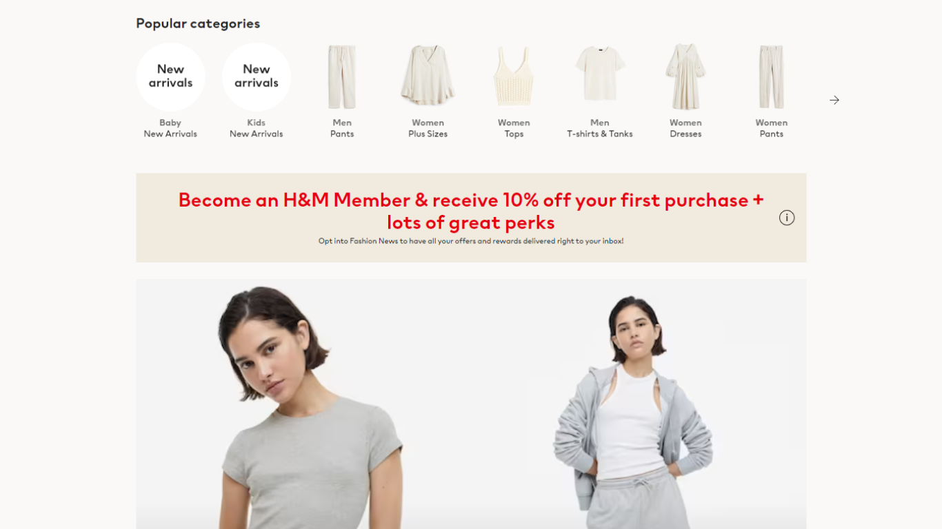
- Create visually cohesive pages with clear product thumbnails
- Include concise titles
- Allow customers to sort results by popularity, price, or other relevant factors
- Implement infinite scrolling to reduce excessive page loading

Source: H&M
Product Page UX Best Practices for E-commerce
The product page is where the magic happens — it’s make or break time. Here, users make their purchasing decisions so it’s crucial to provide them with a compelling and informative experience that convinces them to take that final step. Below you’ll find a few helpful tips that will help you turn your visitors into customers:
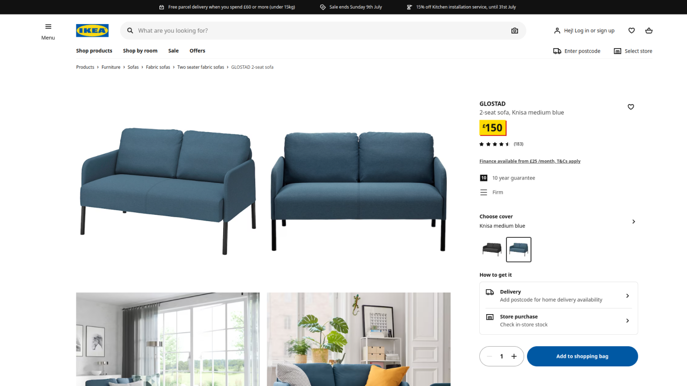
- Present high-resolution images from different angles
- Include detailed and engaging product descriptions
- Add customer reviews, ratings and testimonials to employ the social proof element
- Feature persuasive calls to action, like “Add to Cart” or “Buy Now”
- Make sure the page is easy to read, with essential information readily accessible

Source: IKEA
Checkout Page E-commerce UX Best Practices
Following the best-case scenario, your visitors get to the final stage of their e-commerce journey, where they are 90% sure to make that purchase. If so far you’ve been able to lead them throughout your website, it’s vital to not screw this up at the last 10%. Luckily, here are e-commerce UI best practices that are proven to achieve your goal:
- Keep it clean, uncluttered, and focused on the essentials
- Display the selected items, total cost, and any discounts or taxes clearly
- Provide users with a summary of their purchase, shipping options, payment methods, and estimated delivery times
- Implement trust badges and seals to assure customers their transactions is secure
Conclusion
Now armed with the time-tested e-commerce UX best practices, you stand a bigger chance in today’s digital landscape. Remember to prioritize your customers’ comfort and satisfaction which will in turn drive brand affinity and revenue growth.
And if you want to achieve even greater results, join the Alva Commerce team. Our experts will help you transform your e-commerce endeavors and reach new heights of success.


